
Certainly! Flexbox, or the Flexible Box Layout, is a layout model in CSS that allows you to design complex layouts more efficiently and with less code. It is particularly well-suited for building responsive and dynamic user interfaces. Flexbox introduces a new way to design layouts by distributing space and aligning items within a container, even when their size is unknown or dynamic.
Here are some key concepts and properties related to Flexbox:
- Flex Container:
- To enable Flexbox, you designate a container as a flex container by applying
display: flex;ordisplay: inline-flex;to it. - The children of a flex container become flex items.
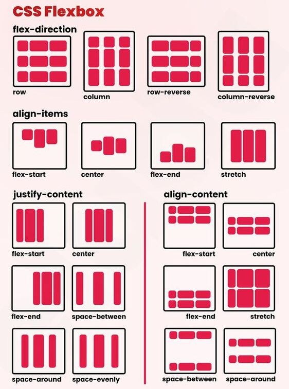
- Flex Direction:
flex-directiondetermines the primary axis of the flex container and the direction in which the flex items are placed. It can be set torow(default),row-reverse,column, orcolumn-reverse.
- Justify Content:
justify-contentaligns flex items along the main axis. It can be used to distribute space between items (space-between), around items (space-around), or at the start/end of the container.
- Align Items:
align-itemsaligns flex items along the cross axis. It controls how items are aligned in the perpendicular direction to the main axis.
- Align Self:
align-selfis a property that allows the default alignment to be overridden for individual flex items.
- Flex Wrap:
- By default, flex items are laid out in a single line.
flex-wrapallows items to wrap onto multiple lines when the container’s space is insufficient.
- Flex Grow, Flex Shrink, and Flex Basis:
- These properties (
flex-grow,flex-shrink,flex-basis) control how flex items grow, shrink, and establish their initial size in the flex container.
- Ordering:
- The
orderproperty allows you to control the order in which flex items appear within the flex container.
Here’s a simple example of a flex container and its items in HTML and CSS:
<!DOCTYPE html>
<html lang="en">
<head>
  <meta charset="UTF-8">
  <meta name="viewport" content="width=device-width, initial-scale=1.0">
  <style>
    .flex-container {
      display: flex;
      justify-content: space-between;
      align-items: center;
    }

    .flex-item {
      flex: 1; /* shorthand for flex-grow, flex-shrink, flex-basis */
    }
  </style>
</head>
<body>
  <div class="flex-container">
    <div class="flex-item">Item 1</div>
    <div class="flex-item">Item 2</div>
    <div class="flex-item">Item 3</div>
  </div>
</body>
</html>
In this example, the .flex-container is set to display as a flex container, and its items (Item 1, Item 2, Item 3) are evenly spaced along the main axis due to justify-content: space-between.
Flexbox provides a powerful and intuitive way to create flexible and responsive layouts in web development.

